Build a personal wardrobe with aquarium-inspired colour palettes

A personal wardrobe becomes more expressive when its colours feel intentional rather than accidental. Aquariums offer a rich source of inspiration: soft mineral tones, vivid flashes of fish scales, planted greens and filtered blue light coexist without visual noise. By translating these relationships into clothing, you can build a palette that feels recognisable, flexible and genuinely your own.
Underwater colour harmony can inspire a more personal wardrobe
An aquarium is not simply a container of bright fish and blue water. Its visual balance often comes from a calm background, natural textures, living plants and a few concentrated points of colour. This approach can transfer easily to fashion, where a dependable neutral base gives distinctive shades room to stand out.
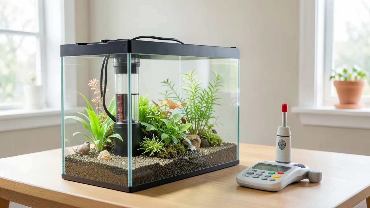
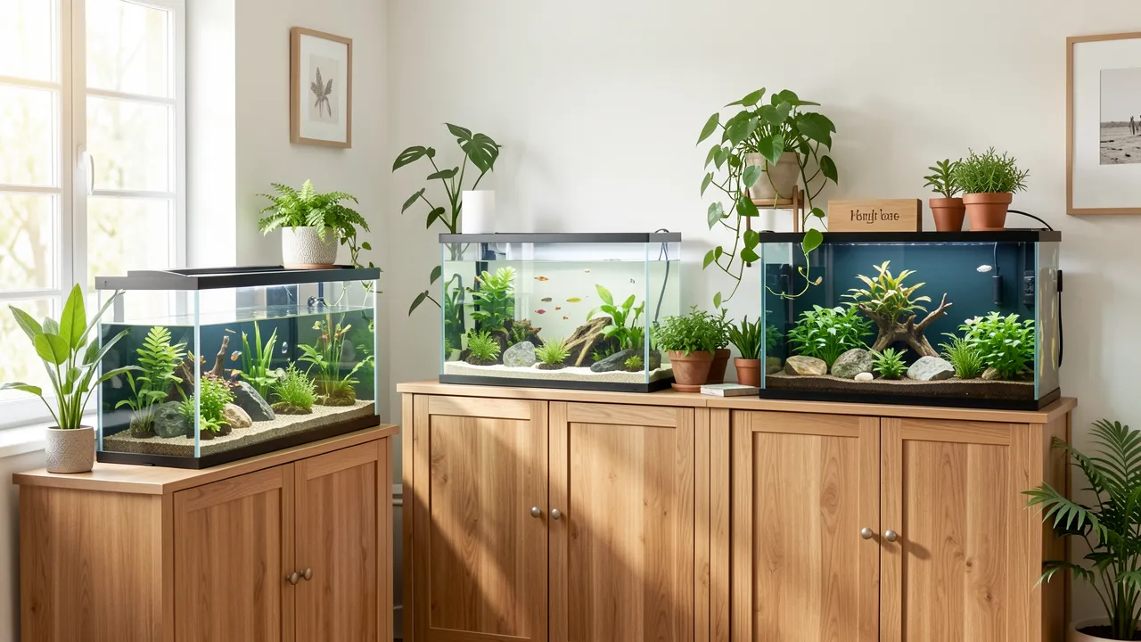
For aquarium and interior inspiration, www.brigit-project.eu provides a useful reference point for considering how aquatic environments contribute to a room’s atmosphere. Aquatic planting, stone-like substrates, reflections and lighting can create layered colour schemes that feel calm or dramatic. When viewed as a design composition, an aquarium suggests ways to balance cool depths, organic greens and small flashes of brightness. Those same principles can guide the colours you repeat in your clothing.
Rather than copying an aquarium literally, focus on its colour relationships. A planted freshwater tank may suggest moss green, charcoal, sand, muted teal and copper. A reef-inspired scene may lead you towards creamy white, coral, turquoise and deep navy. The goal is to create wearable colour combinations that fit your complexion, preferences and daily routine.
Choose a palette family instead of isolated favourite colours
A single favourite shade does not automatically create a useful wardrobe. A palette family includes colours that can be worn together in several proportions. Think of it as a small ecosystem: every tone has a role, but not every outfit needs every colour.
Start with three groups:
-
Base colours form most of your wardrobe and make dressing easier. Inspired by aquarium rock, driftwood and shadow, consider navy, soft black, mushroom brown, stone, warm grey, ivory or olive. Choose two or three that work together, such as navy, cream and taupe. These shades should suit the settings you regularly move through, from work meetings to relaxed weekends.
-
Supporting colours add personality while remaining easy to combine. Aquatic plants and water reflections can suggest eucalyptus green, dusty blue, petrol, faded lilac or muted rust. Use these for knitwear, shirts, trousers, skirts or light outerwear. A petrol blue overshirt, for instance, can work with charcoal denim, cream chinos and olive trousers.
-
Accent colours provide the energy of a bright fish against a quieter background. Coral, saffron, cobalt, fuchsia, vermilion or electric turquoise can become part of your signature. Keep them concentrated in a scarf, handbag, trainers, patterned blouse, tie, jewellery or one statement layer. This gives your wardrobe character without making every outfit feel overdesigned.
Build your core palette around real life
The most successful personal style palette works in the life you already lead. Before buying new pieces, look at what you wear repeatedly. Notice the colours you reach for when you want to feel polished, comfortable or confident. These are more useful clues than a trend forecast.
Also consider practical factors. If you commute, travel, work in a formal environment or care for young children, pale colours may be less suitable as daily bases. You might prefer deep navy, olive and chocolate, reserving light sand or icy blue for shirts and summer fabrics. If your wardrobe needs to move from office hours to social plans, a dark neutral base with one aquatic accent can feel refined without looking rigid.
Try creating a simple personal style palette of five to seven colours. One example could be charcoal, oyster, forest green, deep teal, faded denim blue and burnt coral. Another could be camel, ivory, ink navy, seafoam, terracotta and gold. Each palette has enough contrast to avoid boredom, while remaining coherent across seasons.
Test colours through outfit repetition
A colour earns a place in your wardrobe when you can style it at least three ways. Before choosing a new turquoise jacket or coral jumper, picture the existing items it can meet. If it works only with one pair of trousers and one shirt, it may be better as an accessory.
Repeat your selected colours across different fabrics and garment types. A deep teal can appear in a wool coat, a silk scarf, a casual T-shirt and a leather belt. This repetition makes your wardrobe look considered, even when the individual pieces are simple. It is one of the most reliable ways to build a signature style without relying on matching sets.
Accents and accessories can create controlled contrast
Aquarium-inspired dressing is often strongest when contrast is measured. In underwater scenes, bright colour tends to appear against darker water, pale sand or dense planting. Your outfit can follow the same principle: place a vivid accent against a quiet foundation.
A navy suit with a sea-green pocket square offers a restrained version of this approach. For casual dressing, try washed black jeans, an ivory T-shirt and trainers with a cobalt detail. A cream dress can gain a sharper identity with a rust-red bag and dark brown sandals.
Patterns also work well when they contain colours from your existing palette. Look for prints that combine your base and accent shades, such as navy with coral, olive with sand, or charcoal with blue-green. This creates visual continuity and prevents patterned pieces from becoming wardrobe orphans.
Create a wardrobe that feels recognisably yours
Colour harmony does not require strict rules or identical outfits. It gives you a dependable framework, leaving room for mood, weather and experimentation. Begin with colours that already feel natural to wear, then introduce one aquatic-inspired supporting shade and one brighter accent.
Keep these principles in mind:
- Anchor outfits with dependable neutrals such as ink navy, stone, olive or warm grey, so that bolder colours remain easy to wear.
- Repeat your chosen shades across categories, including knitwear, shoes, bags and outerwear, to create visual continuity.
- Use vivid accents in smaller doses when you are uncertain, then expand them into larger garments once they prove versatile.
- Balance cool and warm notes thoughtfully, pairing teal with camel, coral with navy, or moss green with soft cream.
- Review new purchases against your palette, choosing items that can form several outfits rather than relying on a single occasion.
A wardrobe shaped by aquatic colour harmony can feel calm, distinctive and adaptable. With a stable base, carefully chosen supporting tones and expressive accents, you can make colour a lasting part of how you present yourself.